When I was in college 35 years ago, there was a major fad of neo-Malthusian doom-mongering, led by the “Limits to Growth” book and movement. A retreat was organized from the college, and some concerned, environmentally conscious professors and students, myself included, went off for a concentrated seminar in which we educated each other about all the models and dire predictions of the coming collapse.
My roomate became especially concerned, and got hold of the “World Dynamics” modelling system and language (“DYNAMO”) and the Club of Rome model and ran it on Drew University’s IBM 1130 computer.
Our 1130 had less processing power than a modern calculator watch and a grand total of 16,234 bytes of memory. It chugged through this simulation of all the Earth’s economy, resource extraction, technological development, and ecological impacts in just a few minutes, and spat out the graphs telling us we were all doomed.
My roomate got an “A” from his concerned professor, graduated, and went on to be a successful business executive.
Limits to Growth is a breathtakingly simplistic model of the phenomena it claims to explain. As one modeller of the period writes in a re-assessment of its hubris,
During the past 30 years I have contributed to this oeuvre in various ways, beginning
with a long-range forecast of technical developments concerning energy’s impact on
the global environment [1]. In the early 1970s I also began using MIT’s DYNAMO in
building models embracing energy, environment, population, and economy. One of
those exercises, a long-term look at CO2 emissions from fossil fuel combustion and their
role in future global warming, was published in 1974, when few people were interested
in such a topic [2].
The reception given to The Limits to Growth [3], the most celebrated forecast of
its time, which used DYNAMO to model the entire world, made me very uneasy about
long-range predictions. When taking the model apart, line by line, I was particularly
astonished by the variables labeled Nonrenewable Resources and Pollution. Lumping
together (to cite just a few of scores of possible examples) highly substitutable but
relatively limited resources of liquid crude oil with unsubstitutable but immense deposits
of sedimentary phosphate rocks, or short-lived atmospheric gases with long-lived radio-
active wastes, struck me as extraordinarily meaningless.
Despite the fact that some writings identified major flaws of The Limits to Growth
right after the book’s publication [4, 5], too many people took seriously this grotesque
portrayal of the world that pretended to capture the intricate interactions of population,
economy, natural resources industrial production, and environmental pollution with
less than 150 lines of simple equations using dubious assumptions to tie together sweeping
categories of meaningless variables.
Limits to Growth was roundly trashed by most economists and spent 30 years in the dustbin of history. Even its simplistic model had to be finely tuned: modify just 3 of the parameters by 10% and no collapse occurs.
But the pendulum has swung back and the acolytes of neo-Malthusian apocalypticism are again in full cry. In recent months the blogosphere has been echoing with claims that lo and behold, the Limits to Growth scenarios have been coming true over the past 30 years:
A real-world analysis of a controversial prediction made 30 years ago concludes that economic growth cannot be sustained and we are on track for serious economic collapse this century.
The reality behind these rumors is this report by Graham Turner of CSIRO Sustainable Ecosystems. Turner compared real-world statistics to the LtG projections since the 70s and finds that they match, which he claims is evidence that the models must be right.
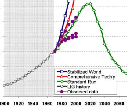
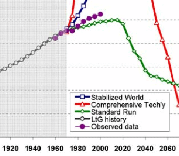
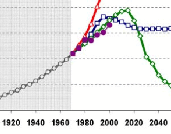
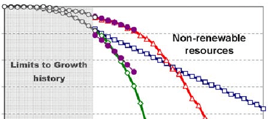
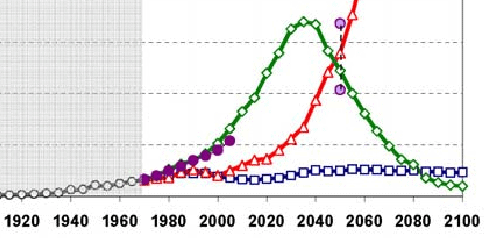
What did he actually find? In the following, the observed data, running from about 1970 to 2000, is the purple lines with the filled circles. The model we are interested in — the one that it’s claimed the data support — is the green one with open diamonds. (The blue open boxes line is the virtuous “sustainable” world with a per-capita industrial consumption of — I kid you not — $350 per year. (see page 7 here and footnote)) All the y-axes are normalized to arbitrary units in the paper.
Here’s the graph for population:
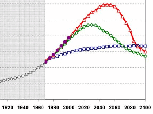
Sure enough, population went up along the growth track that’s a simple extrapolation from previous growth rates. It fits the LtG model because the LtG model matches a simple exponential growth rate to present date. More to the point, it matches the standard mainstream demographic projections:
— which are based on assumptions of steady economic growth throught the century.
There’s no indication whatsoever that it’s about to peak as LtG predicts. Turner’s paper gives no hint of what he considers to be a null hypothesis, or what he would consider to be a falsifying mismatch of the data to LtG predictions.
Here’s the graph for “services per capita” — the upper purple curve is electricity, the bottom ones are literacy (!):
This parameter shows again just how lousy LtG is as a model of any kind of causality. Literacy rates are strongly affected by worldwide religions which prohibit the education of women; electricity rates, and thus usage, are affected by everything from resource depletion, which they are trying to measure, to political distortion of technology substitution.
Even so, the real-world graphs are just as consistent with a slow-growth or leveling-off null hypothesis as they are with LtG. No hint of a collapse is to be found.
Here’s food per capita:
You would expect food per capita to level off rather than to increase exponentially — once gastronomic satiety is achieved, additional wealth is spent on other pursuits. The actual data fit this null hypothesis perfectly, with no evidence whatsoever than a catastrophic drop is eminent.
Next is industrial output per capita:
Again, perfectly consistent with a standard growth curve with no reason to believe that the LtG has anything to do with reality. Note that the recent dip in output has nothing to do with resource depletion, and everything to do hubristic modellers messing with things they didn’t understand.
Here are non-renewable resources, particularly fossil fuels, shown with upper and lower bounds:
The key to understanding this graph, and indeed the entire LtG mindset, is that they assume there is a fixed amount of something we can’t do without, and then predict that if we continue to consume it, we must necessarily run out. Note, by the way, that even the “sustainable” prediction runs out too, as it must. It just takes longer.
Perhaps one of the reasons that LtG got such play in the 1970s was that they were actually experiencing what was effectively “peak oil”, as I argue here. But the history since then actually bolsters the substitutability argument more than it does a finite-resources point of view.
First, rising prices spur development and new technologies make recovery of hitherto expensive resources cheap. This effectively increases the supply.
Second, in the case of energy, other ways of getting the same effect are found, such as buying insulation instead of more heating oil. One of the worst effects of apocalypticism is that it often impedes these efforts and thus becomes a self-fulfilling prophecy. A classic example is the strangulation of nuclear power in the US contemporaneous with LtG. All our currently-running reactors are designs from the 1970s. Compare today’s computers with 1970s ones and see how different the reactors might be today if the same kind of development had taken place.
And finally we have the graph for pollution:
This graph is a case of a complete bait-and-switch. The “actual data” line has nothing to do with anything that was considered pollution in 1972; it’s CO2. CO2 is a very cheesy proxy for pollution, since the Earth has a hormesis response to its levels: too little of it would be as disastrous as too much (ice ages). Meanwhile, the levels of actual pollutants have gone down in the more advanced industral societies even as they have gone up in the more recently-developing ones such as China. History indicates that pollution levels rise with industrialization to a certain level and then decline, a phenomenon that LtG completely ignores. (and if we’re substituting, why can’t we have “computing cycles per capita” in Services?) So I would claim that this graph is comparing apples and oranges and says nothing substantive.
The point of LtG wasn’t about the nice exponential growth we’ve actually seen between 1970 and now; it’s about the collapse they predict in 20 more years when we run out of everything. As the acolytes of apocalypticism at New Scientist put it:
The book predicted that the 21st century would see mass starvation and economic collapse, as humanity exhausted natural resources. … But [Turner’s] study in 2008 showed that the book’s predictions of changes in industrial production, food production and pollution had been largely correct[.]
But this is idiotic. All Turner’s figures show is that we’ve been on a nice, steady exponential growth curve. They say nothing whatsoever about “mass starvation and economic collapse.” The paper makes not even the slightest attempt to distinguish cases which would support a simple null hypothesis of continued growth from those which would support LtG. There is not one shred of evidence — none — to support the latter.
